Published on August 16th, 2022
Last updated on February 6th, 2023
5 Tips On How To Paint Rooms Different Colors When The Rooms Run Together
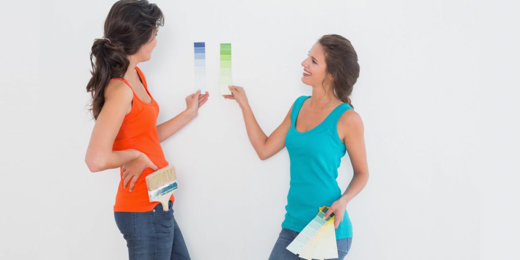
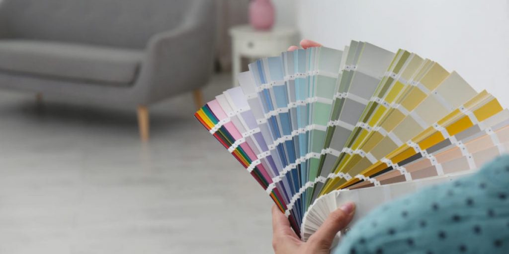
So many humans and so many minds in terms of a color palette. Some people like to paint rooms with bright colors. Others want a calm environment and prefer neutral tones. In any case, three is such exciting option like connecting rooms with color flows. It can be created by combining and harmonising several colors or adding accessories and decor elements. When rooms are too different from each other in terms of color, there is an imbalance and even an urge to flee the house. Of course, hiring a color consultant or interior designer is now possible. But you can try to manage connect your house rooms with color on your own by using transition paint colors between rooms, accessorise and logical, professional advice.
5 Tips On Connecting Rooms With Color
Elegance is subjective, just like beauty. However, we can all identify some basic principles of elegance and differentiate how one home is more elegant than another. A beautiful space in which you reside is a reflection and extension of you, who you are and what you love. To make the house more elegant, you can try using the following methods:
- Create a flow with color;
- Use transition paint colors between rooms;
- Connect the adjacent rooms with colors;
- Connect rooms with other interior items;
- Try to color rooms with the “60%-30%-10%” formula.
Now in more detail about each item.
1. Create A Flow With Color
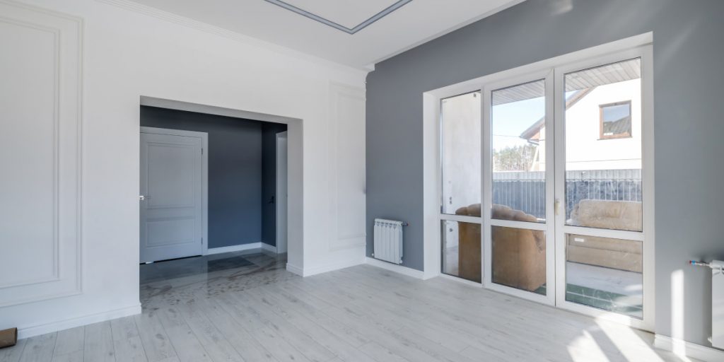
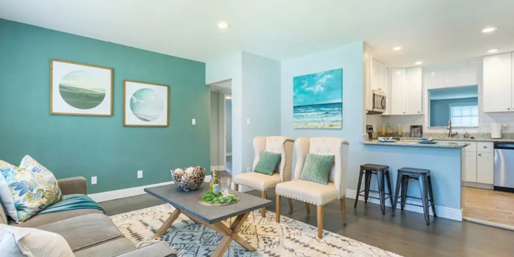
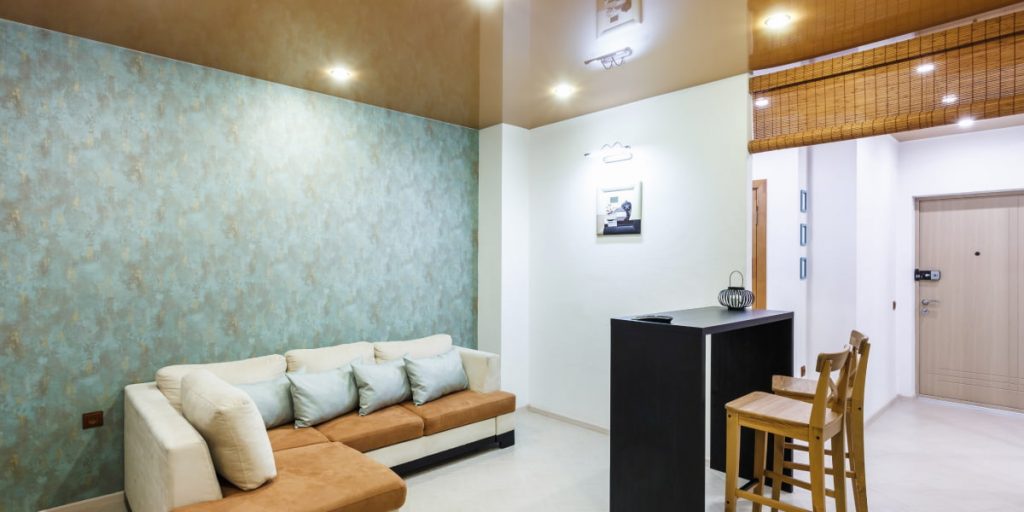
Always use a consistent paint tone when the rooms run together. It’s not just about open-plan kitchen-dining-living rooms. Of course, there should also be one color scheme in one spacious room, a basic shade that will be predominant in all the functional areas. But there are other layout options. For example, the hallway flows seamlessly into the living room. There are no doors between the foyer and the main connecting room of the house – you need to choose to color the same tone for these rooms so as not to create dissonance. The most popular connecting colors are still beige, white and grey. We can hardly imagine any interior design without them.
2. Use Transition Paint Color Between Rooms
The palette choice for color rooms can consist of 2-3 main colors and 3-4 complementary colors. For example, cream, brown and green can be chosen as the main colors. The complementary colors can be lighter or darker shades of ‘cream, brown and green, such as champagne, ivory, beige and pastel green. Avoid harsh colors or any color that contrasts strongly with other colors unless you seek contrast for a particular characteristic or reason. Consider using trim as a unifying element and repeat the same color or finish on baseboards, door and window frames and ceiling mouldings.
3. Connect The Adjacent Rooms With Colors
- Explore the possibilities of the view. Standing in the living room, which house rooms do you see? The hall, kitchen, or dining room? Then their color palette should complete each other. You don’t have to use just one shade, but they should be friendly;
- Limit yourself to colors from the same “temperature”. For example, warm – yellows, oranges, and reds. Or, conversely, cool – blues, greens, greys. Such a combination will be harmonious and, at the same time, allow you to diversify the color palette of different rooms;
- Experiment with one color by changing its shade. For example, the primary color is blue. But there are also greys and light and dark blues. Blending paint colors can go from room to room. The base color can be changed by inking, reducing the saturation, adding white, diluting, or on the contrary, condensing. It’s an excellent way to unify a room without using just one tone;
- Use the brightest, most dramatic shades only in isolated rooms that cannot be seen from other rooms. For example, a bathroom, the door to which is almost always closed. If the room is enclosed by four walls and has an interior door, you can experiment and choose a color that is radically different from the rest of the color scheme;
- Use the same accent color in different rooms. For example, you have a living room with blue and blue. The dining room is blue and green, and the kitchen is blue and yellow. Blue will tie all the rooms together.
4. Connect Rooms With Other Interior Items
You can connect adjacent rooms by blending paint colors from room to room. It can be applied with very contrasting colors by using flooring or rugs that include both colors. For example, lay a multi-colored patterned rug in a hallway to create a space between a neutral and a more colorful area. Remember that wall and carpet colors do not have to match precisely. One can be slightly darker or lighter than the other, and the eye will still perceive them as closely related.
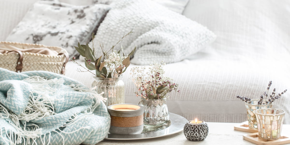
- Add brightness with accessories that are easy to replace. Cushions and other textiles are the best helpers in this regard;
- Create a focal colour point in the room. This focal point or feature should be something that catches the eye or starts a conversation when visitors enter. It could be a very elaborately decorated mirror, an eye-catching painting, an unusual sofa, or a wall painting. Let one thing be the only attraction in the room, and let everything else blend in and support it.
5. Try To Color Rooms With The “60%-30%-10%” Formula
According to designers, there are no strict rules for creating a color flow in all the house rooms. But still, there is a fundamental principle – 60/30/10. That is, 60% of the finish should be a primary and preferably neutral color, 30% should be some lovely shade, and only about 10% is left for a bright accent. The formula is the percentage of the three colors. The three colors that will be most prominent to one degree or another in the rooms are identified.
- 60% focus on the primary color:
More than half of the interior elements should be in the main color.
You can safely use it on the walls. It is better if it is neutral.
However, if the client asks for bright colors – you can use them, but be careful! Then let other elements be in neutral tones.
- 30% should be an additional color:
The job of this color is to add interest to the interior. It could even be your favourite color. The stated 30% of the formula is safely given to some furniture, carpets and curtains. All these objects must match the color of the rest.
- 10% is needed for accents:
Cushions, vases, figurines, paintings, picture frames, and some elements of textiles. You can even use several shades of the same color to make the interior more interesting.
Bottom Line
Feel free to fantasise about color rooms but don’t forget the room’s harmony. Don’t be afraid to experiment with contrasting combinations and bright accents. It’s much easier to create the interior of your dreams than you might think. If, after reading this, you realise that this isn’t your task, then turn to a professional.
FAQ
Is it expensive to have a beautiful interior?
In 2021 there is a shortage of many goods and materials due to the suspension of some production facilities during the quarantine. Therefore, any renovation is not cheap. The cost of a designer’s services has also risen. An ugly interior is also expensive. It is essential to understand that the owner spends a considerable amount of money on repairs and is very disappointed if they end up with an environment they are not happy with.
Can you blend paint colors from room to room?
Yes, you can. There are no rules or laws. You can color rooms, in the same manner, combine several styles, follow a standard color scheme, or choose your palette for each room.
What can be saved from doing renovations?
A general recommendation in this matter is to keep on items and materials that are easy to replace. Most importantly, never skimp on what is hidden in the walls: pipes, electrics, proper wiring, soundproofing. The rest can be replaced over time. It is better to gradually furnish your flat or house with quality things you like.
How not to turn your apartment into a flea market by decorating it?
The most beautiful flat is where every item has its place. An extra vase can hardly spoil the ambience. Still, a cluttered table, a cluttered kitchen worktop, window sills with a mass of untidy items, a pile of cosmetics on the bathroom sink – these are the main signs of an unorganised, uncomfortable flat, even with a costly renovation. Wardrobes, cloakrooms and closed shelving should be provided in advance.